Wordsearch (Print) — 2023
Honours
Wordsearch provides queer-centred history and definitions on identity. It consists of print and digital resources to give high school students the access to comprehensive sex education which is not currently being provided. Through expressive typography and a non-linear reading experience, the audience is encouraged to craft their own journey of self discovery.
Wordsearch provides queer-centred history and definitions on identity. It consists of print and digital resources to give high school students the access to comprehensive sex education which is not currently being provided. Through expressive typography and a non-linear reading experience, the audience is encouraged to craft their own journey of self discovery.


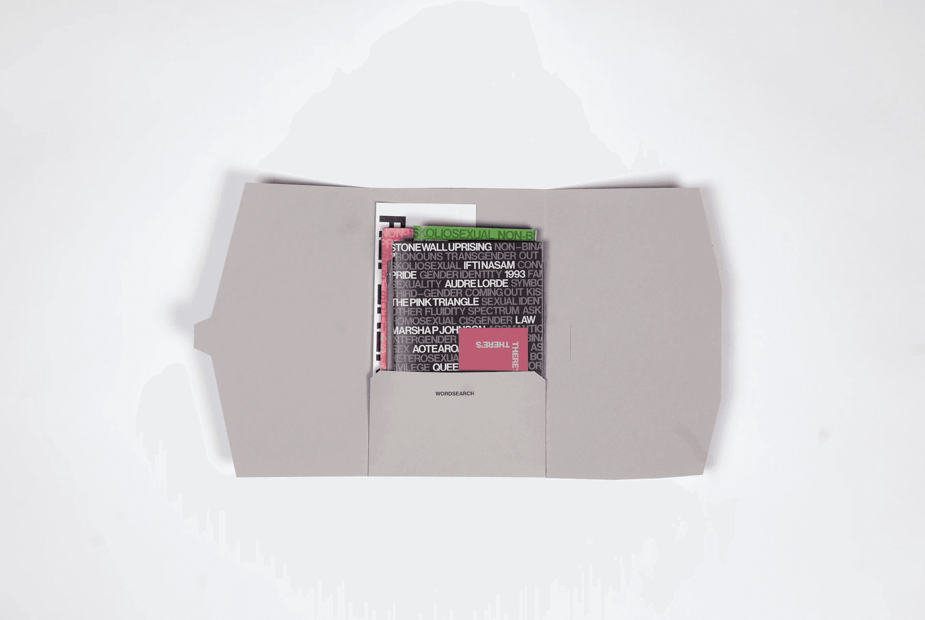


Wordsearch could be applied for personal education and embedded within the curriculum. Its objective is to be the resource that bridges the gap, by bringing the information right to the people that need it most. In doing so, empowering young queer people with self determination over their identity.
Wordsearch could be applied for personal education and embedded within the curriculum. Its objective is to be the resource that bridges the gap, by bringing the information right to the people that need it most. In doing so, empowering young queer people with self determination over their identity.






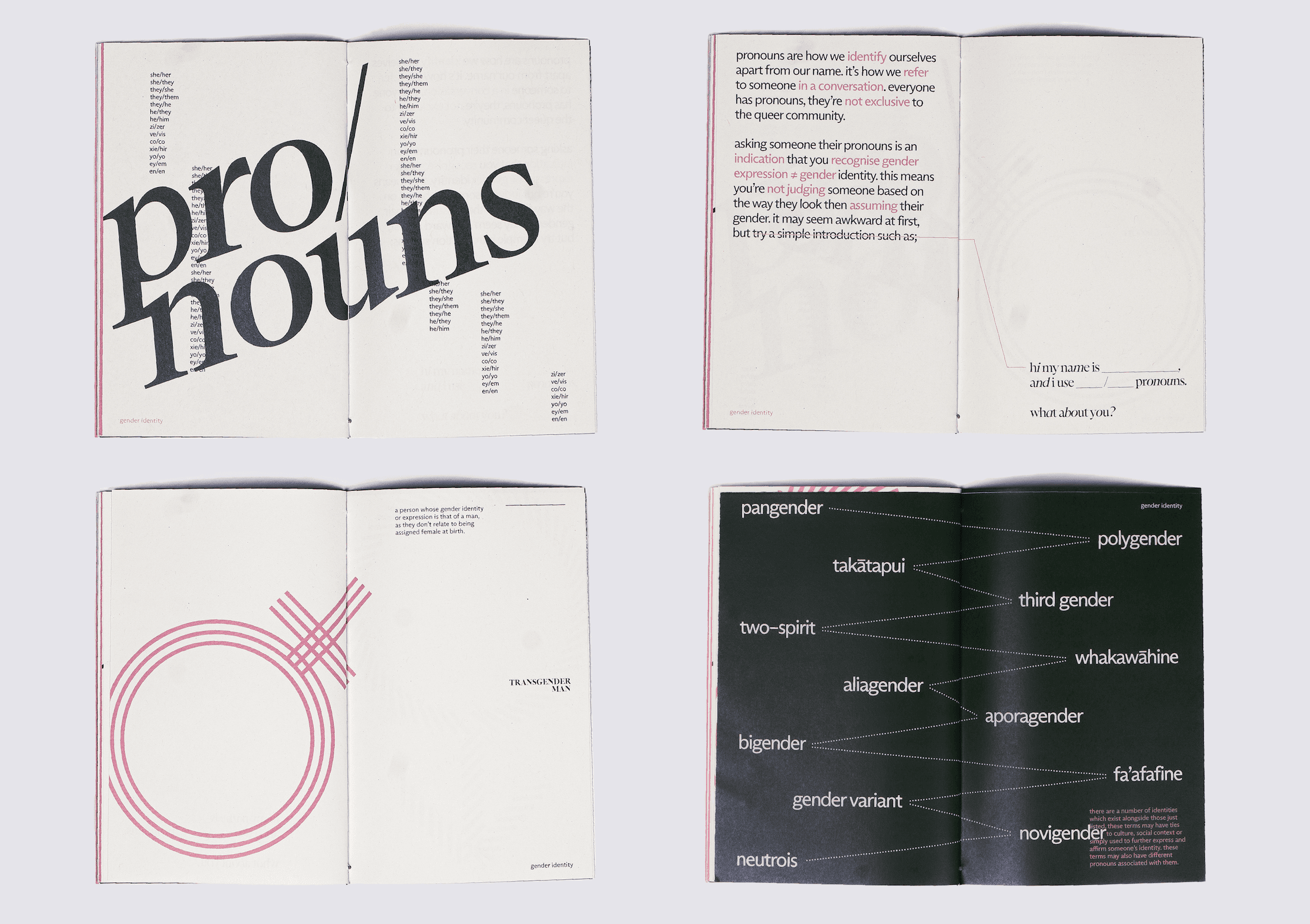


Gender Identity Resource
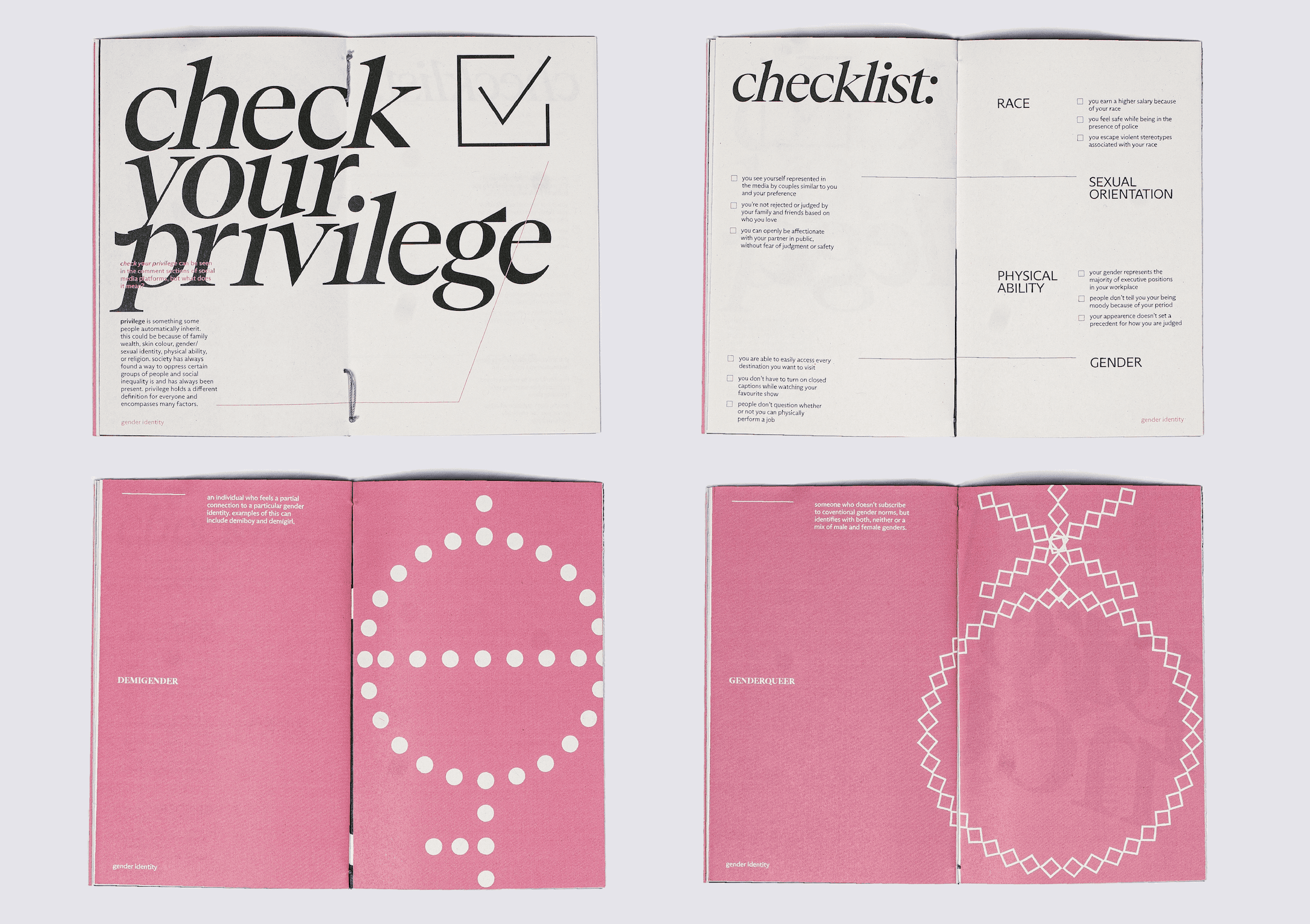
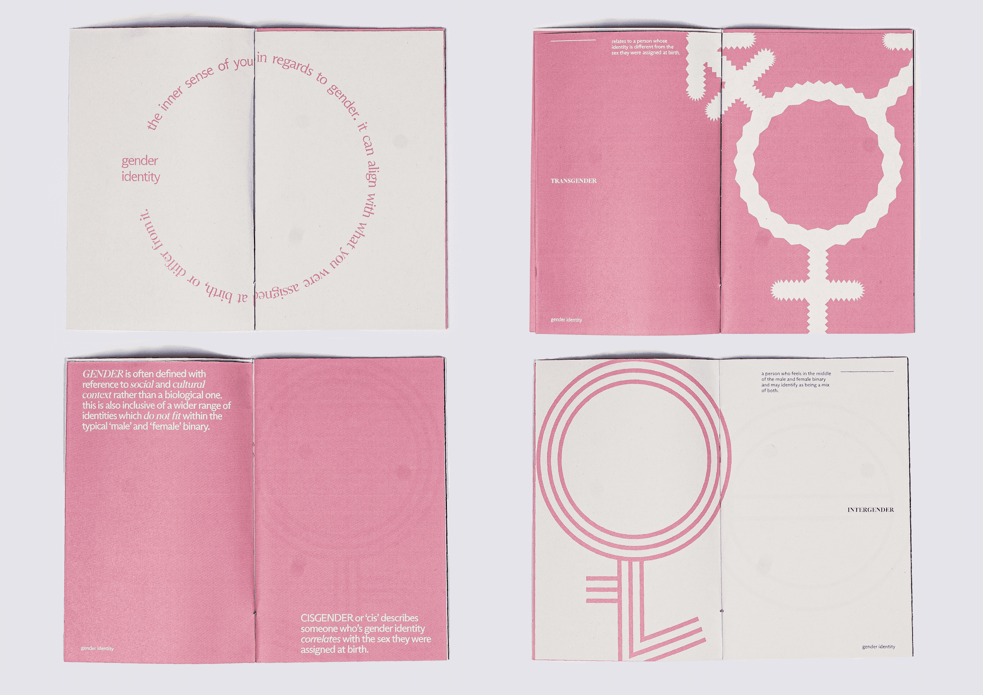
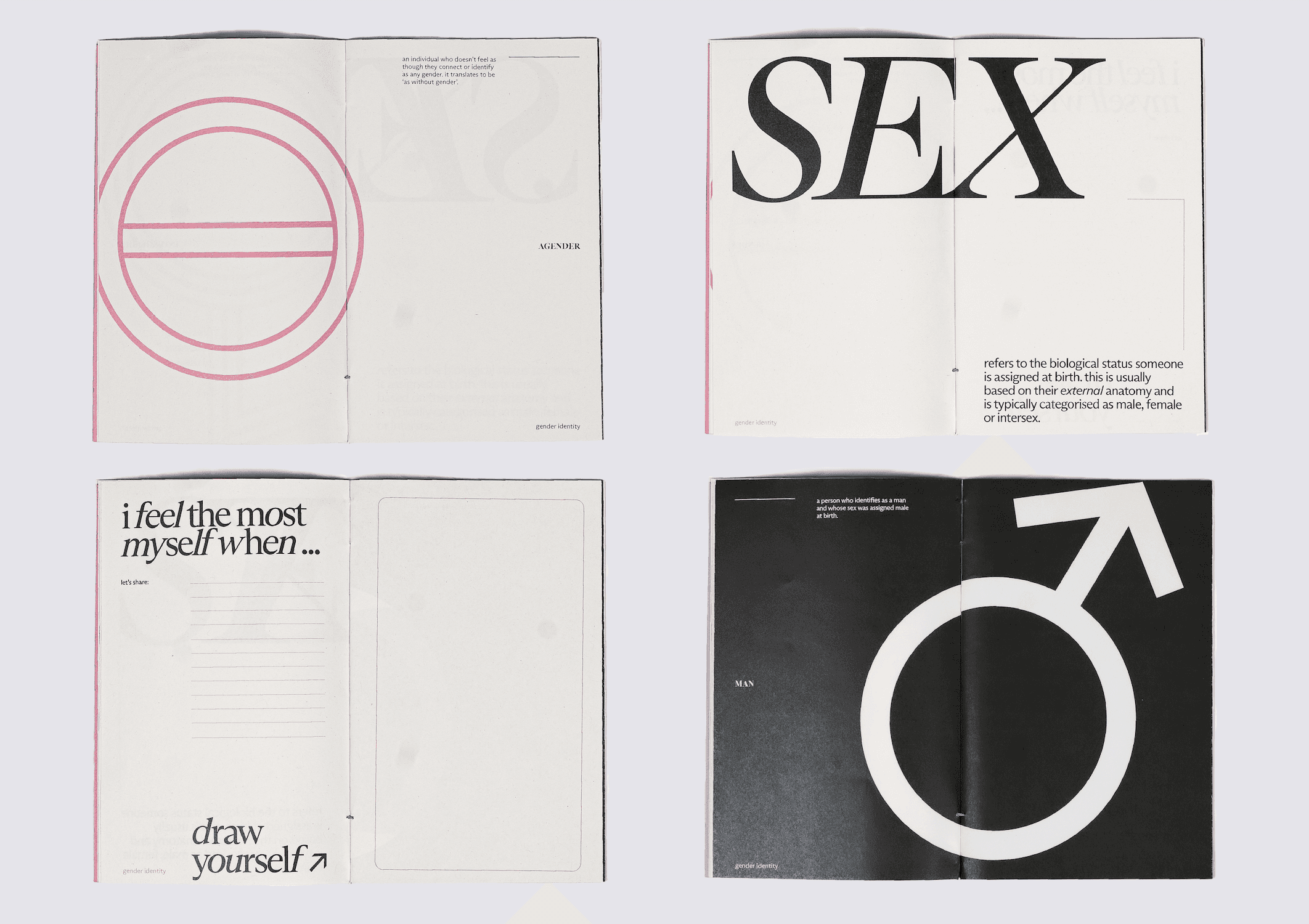
Gender Identity Resource
The primary colours within the project
are pink and green. These colours reference the queer community in a way that is not overt or outing for a queer audience. The pink acknowledges the pink triangle, a symbol that was reclaimed by the LQBTQI+ community and the green is used in juxtaposition to create a more calming and neutral tone. Arizona is a variable typeface and used throughout
the resource. This typeface felt integral
to the design, a sort of metaphor for the queer community. It’s ever changing, diverse in its shape and style but part of the same family.
The primary colours within the project are pink and green. These colours reference the queer community in a way that is not overt or outing for a queer audience. The pink acknowledges the pink triangle, a symbol that was reclaimed by the LQBTQI+ community and the green is used in juxtaposition to create a more calming and neutral tone. Arizona is a variable typeface and used throughout the resource. This typeface felt integral to the design, a sort of metaphor for the queer community. It’s ever changing, diverse in its shape and style but part of the same family.
The primary colours within the project are pink and green. These colours reference the queer community in a way that is not overt or outing for a queer audience. The pink acknowledges the pink triangle, a symbol that was reclaimed by the LQBTQI+ community and the green is used in juxtaposition to create a more calming and neutral tone. Arizona is a variable typeface and used throughout the resource. This typeface felt integral to the design, a sort of metaphor for the queer community. It’s ever changing, diverse in its shape and style but part of the same family.
The primary colours within the project are pink and green. These colours reference the queer community in a way that is not overt or outing for a queer audience. The pink acknowledges the pink triangle, a symbol that was reclaimed by the LQBTQI+ community and the green is used in juxtaposition to create a more calming and neutral tone. Arizona is a variable typeface and used throughout the resource. This typeface felt integral to the design, a sort of metaphor for the queer community. It’s ever changing, diverse in its shape and style but part of the same family.


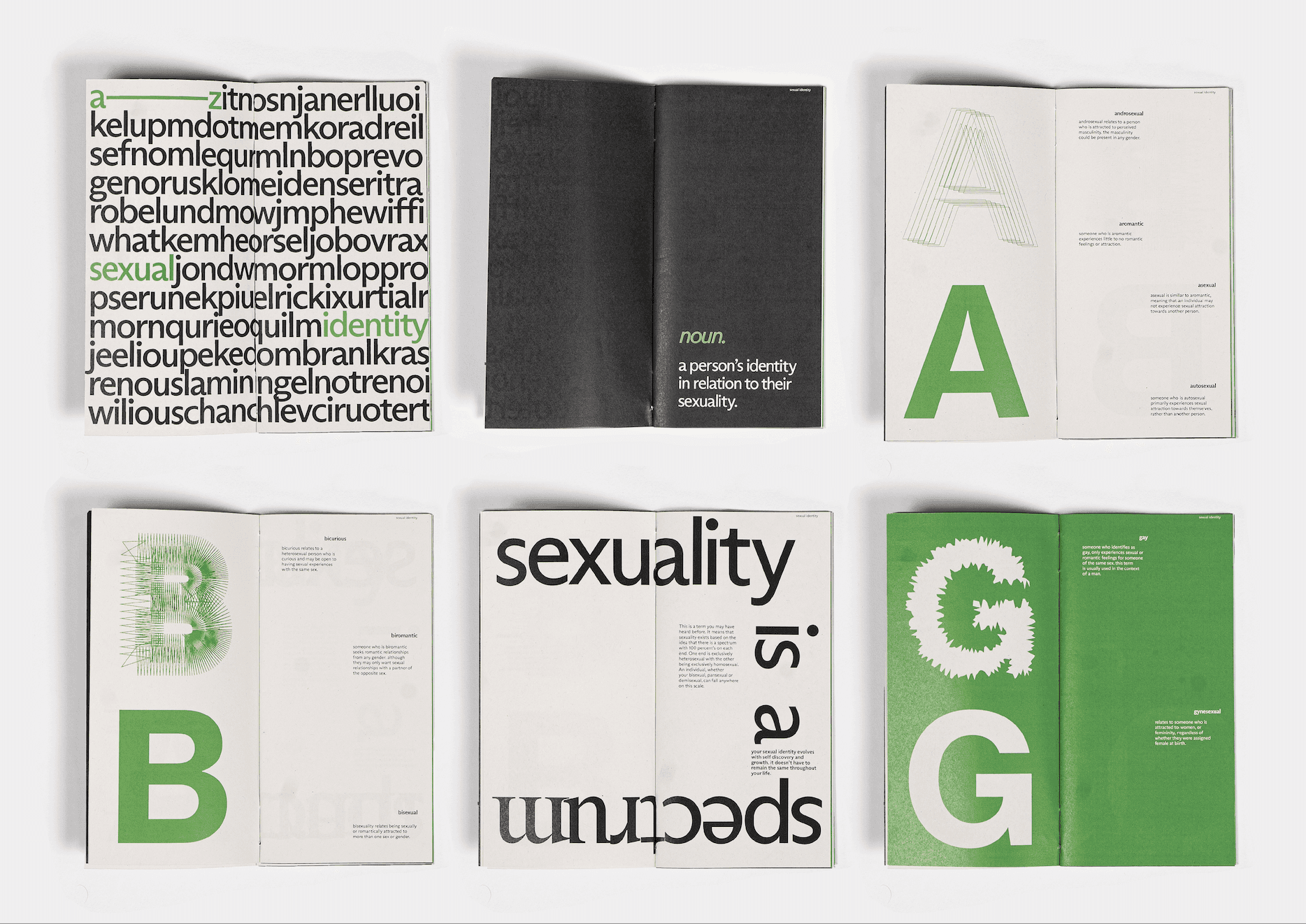

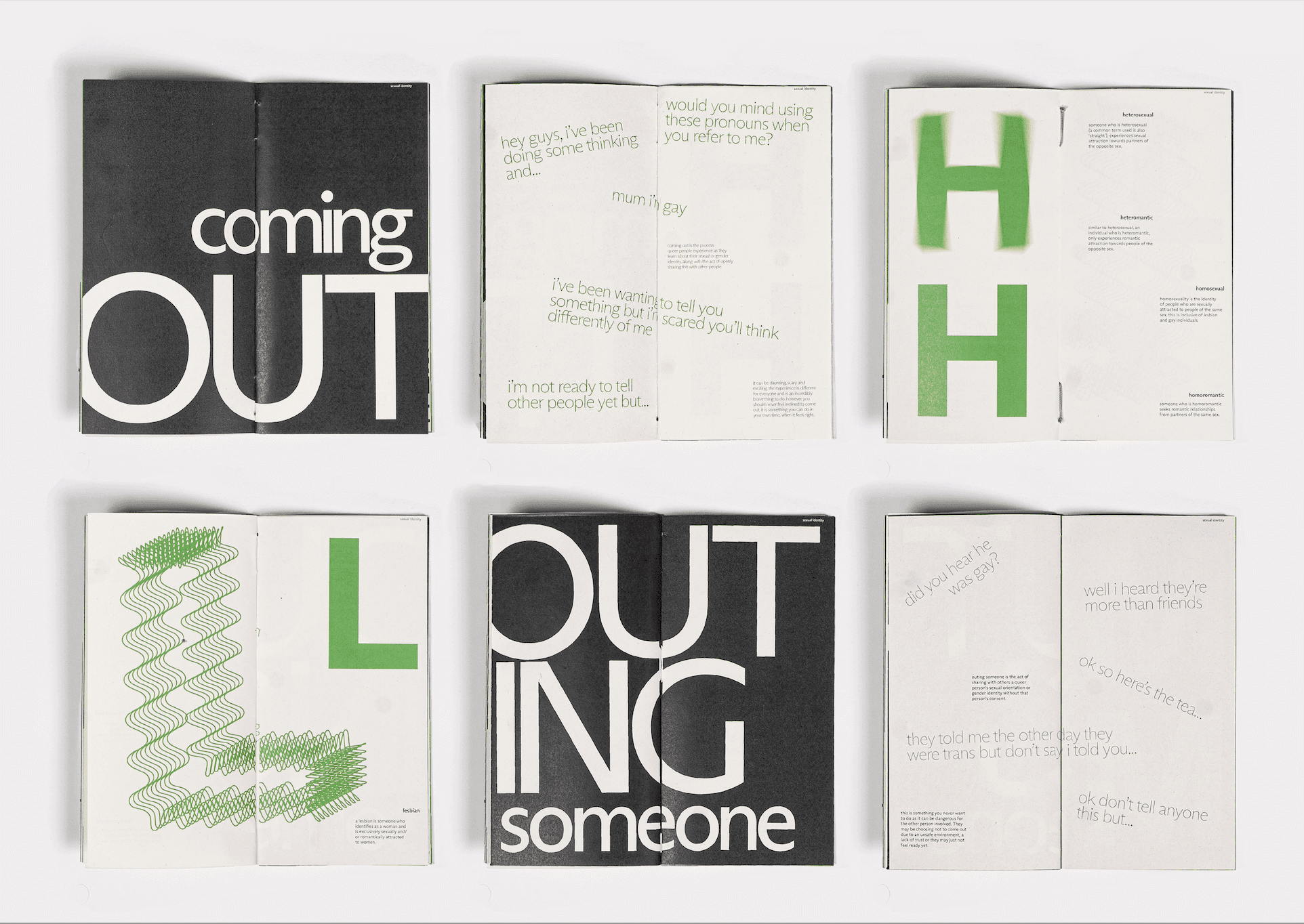

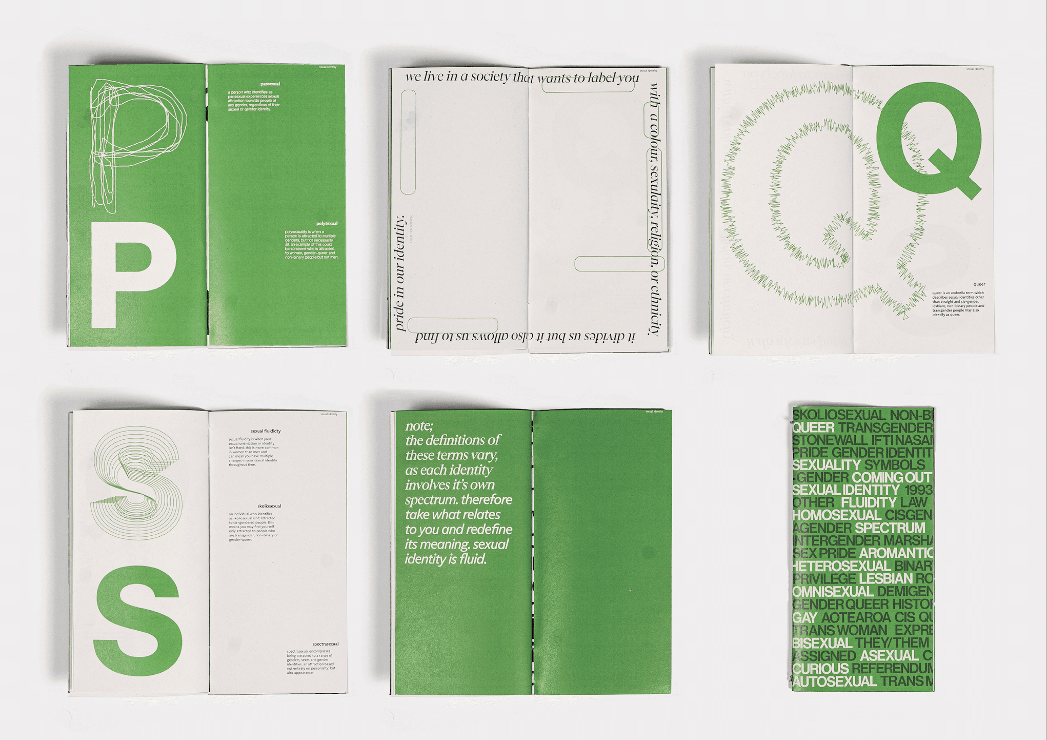


Sexual Identity Resource
Sexual Identity Resource
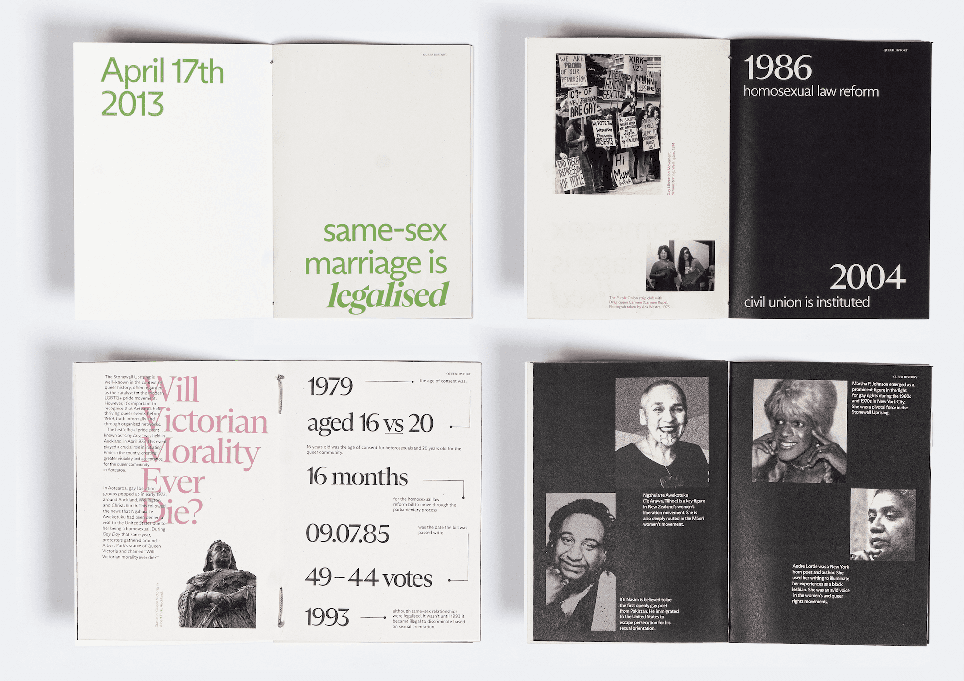


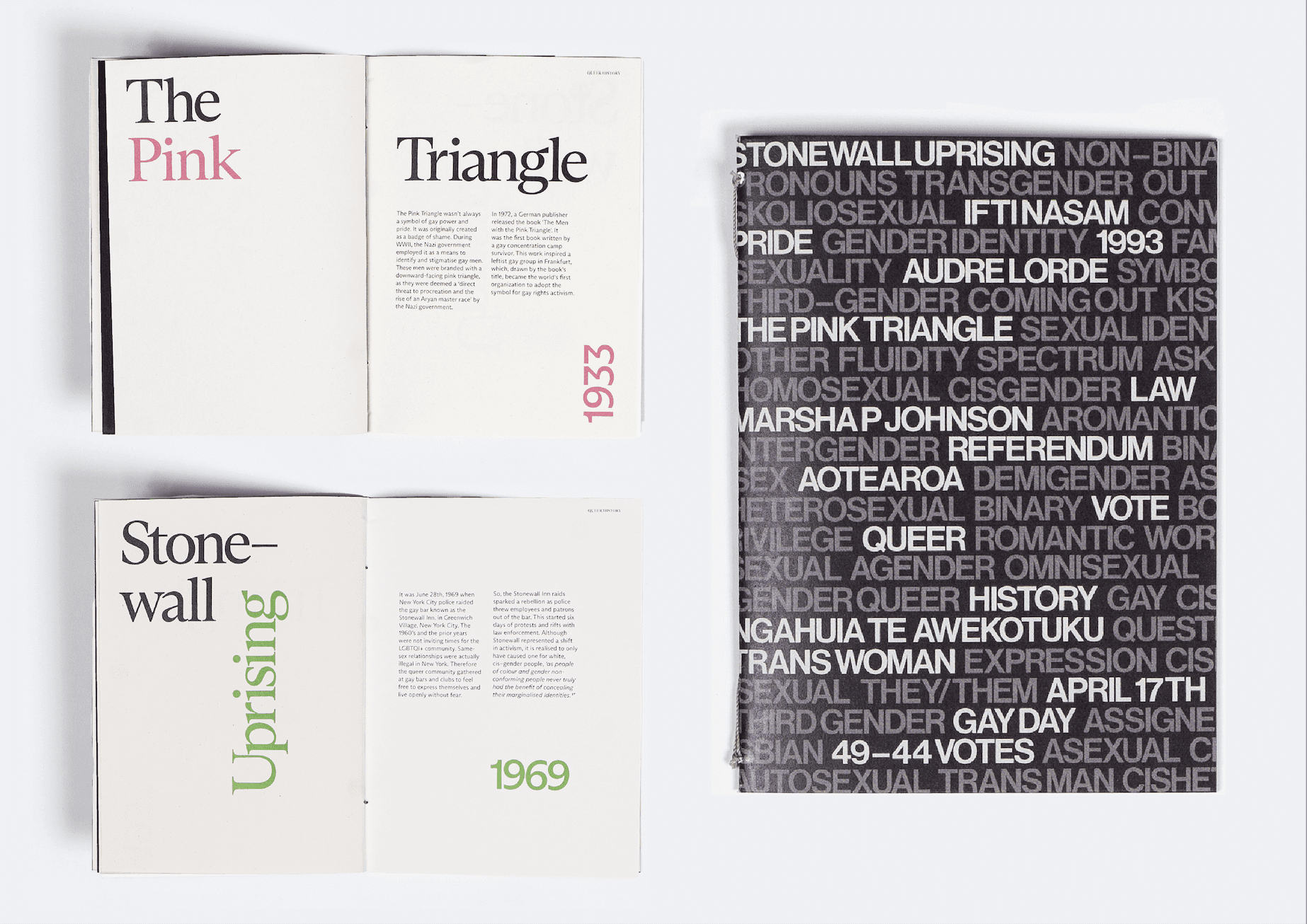


Queer History Resource
Queer History Resource
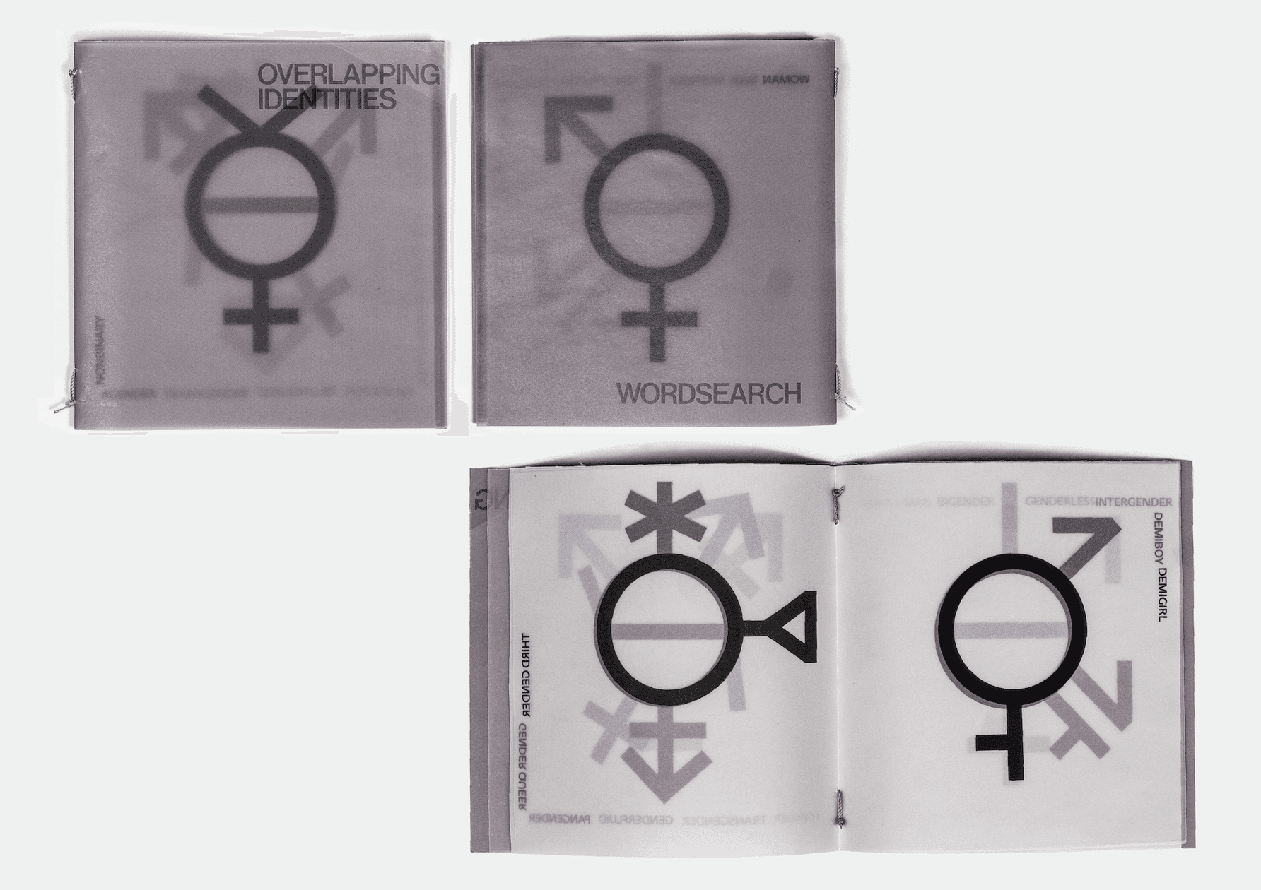


Overlapping Identities Flipbook
Overlapping Identities Flipbook
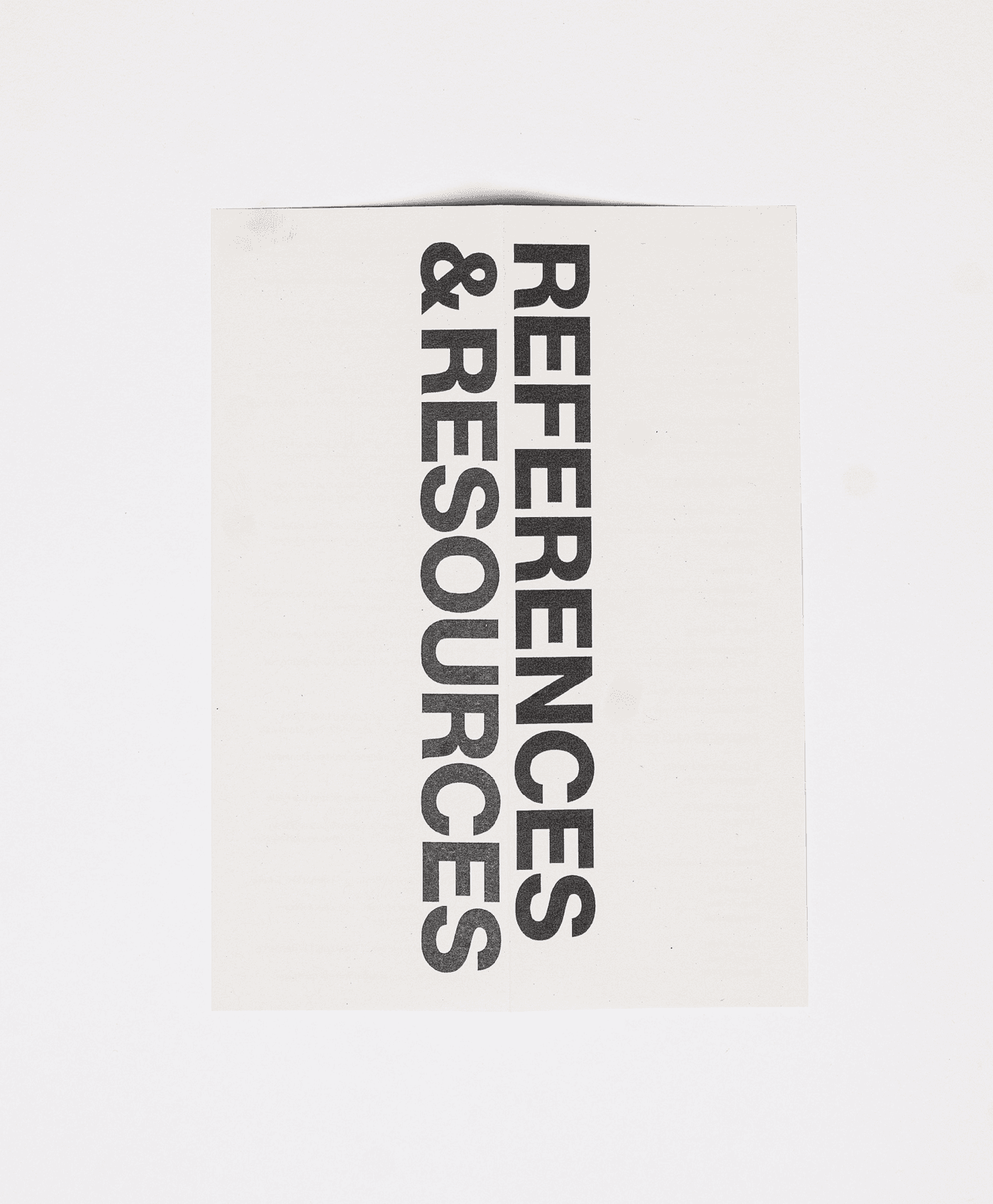


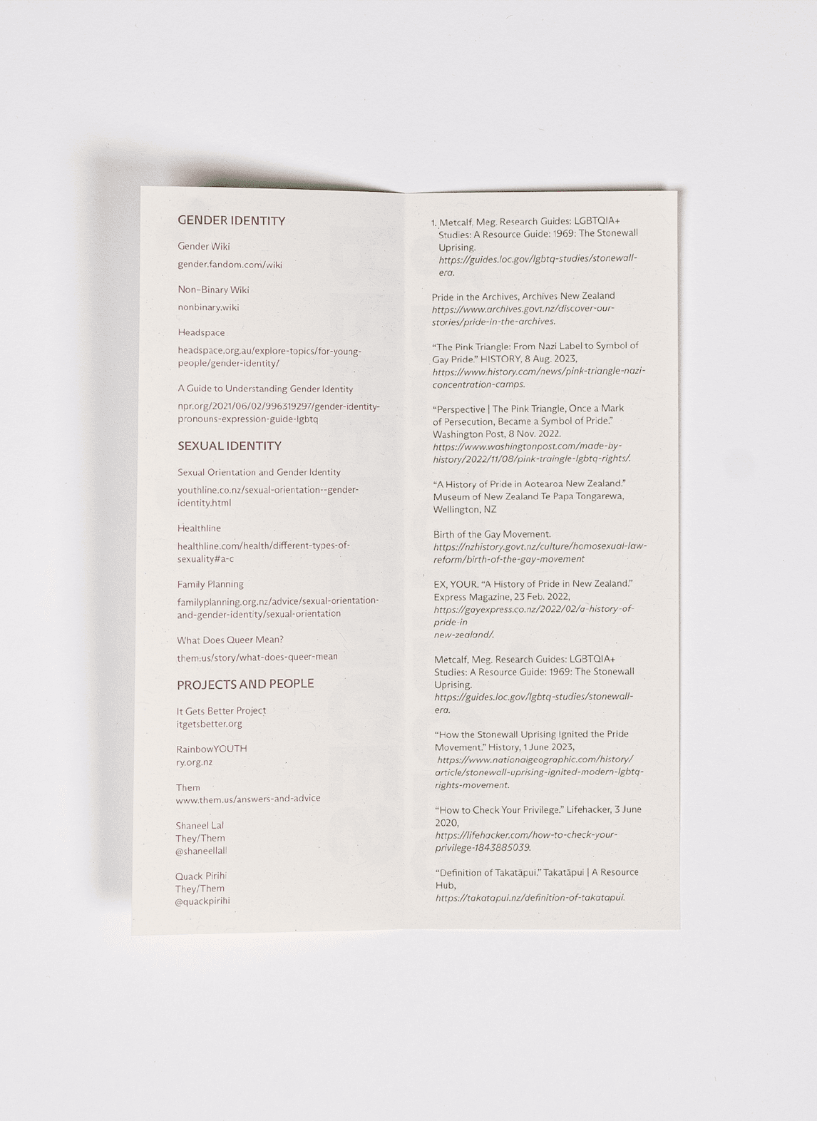


References and Resources Pamphlet
References and Resources Pamphlet
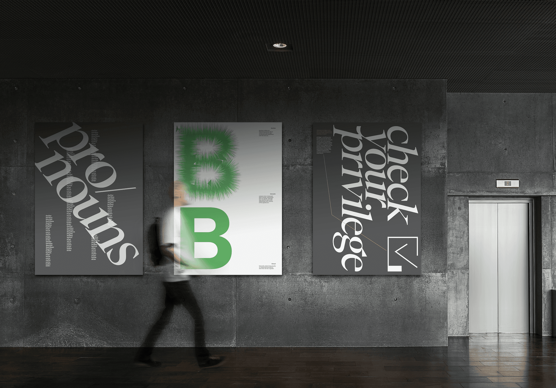


Wordsearch Posters
Wordsearch Posters